Showing posts with label print. Show all posts

Sunday, 15 January 2012

Dissertation – What does the future hold for books?

Before Christmas I completed my dissertation, I looked into the future of books, questioning whether print will be able to rival the popularity and accessibility of ebooks. I though I would be very biased towards print and do still prefer it when reading but there is great potential with digital books and the levels of interaction, making them another platform that offers a different reading experience rather simply a digital replication. Books are having to become more beautiful and innovative in their design to become the choice purchase, but still hold that element of luxury and ownership through their physical form which ebooks struggle to match. 


I decided to present my dissertation both as a book and an ebook/app showing what I concluded; both offer great alternatives to reading but can't truly be compared as they're different reading experiences in their own right. The app works as an extended reference for the figures and footnotes in the dissertation, utilising the iPad's interactive features, linking to images, videos and websites. The video below demonstrates the full use of the app and all the links.


The book was made to the traditional A format as I referenced Penguin frequently through their turning point in paperback design, improving the means of graphics for book covers and providing cheap availability. The book has lighter weight (80gsm), narrower pages matching up the figure references to the body text. The cover uses 300gsm paper compared to 120gsm used for the main pages, the book was printed and bound by hand. Everything was presented in a hand made black box, with insert slots made to the size of the book and iPad, which demonstrates how a sense of luxury can be enhanced through the facility and interacting with the physical form. Pictures can be seen below. 


Wednesday, 30 March 2011

Cigarette litter 5 - design interventions

My final couple of design interventions focus on the cigarette packet itself, as a means of easily getting smokers attention and giving them no reason not to be aware of the issues of littering. This first design works simply as a sleeve, informing smokers of the problems that their used butts can cause. I have tried to give the message a harder impact by relating it to people, and how deadly used cigarette ends can be to us. Displaying the fact that the chemicals left in the butts from a 20 pack are capable of killing 16 adults. 


The final intervention takes this idea a step further by designing the sleeve to feature a waste section for used butts, thereby providing a solution for to smokers throw them away. One issue is the lack of bins for butts, there are some products for smokers to buy such as portable ash trays. However, most people can't be bothered to buy them or simply aren't aware. 


This sleeve centres around a storable compartment to store their fag ends, which can been thrown away when the packet is finished. The compartment is foil lined to stop the butt burning the package. It uses a push mechanism for easy access and is designed with a maximum opening distance to avoid spilling its contents. 


Cigarette litter 4 - design interventions

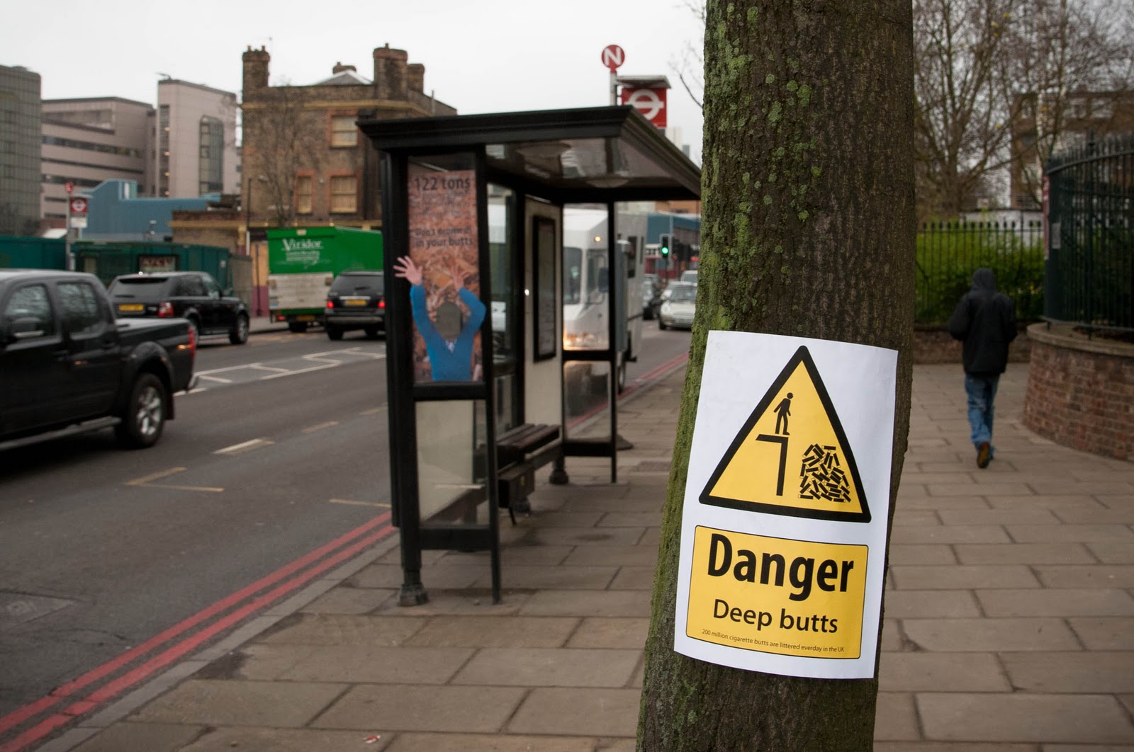
My next intervention leads on from my previous bus stop poster. It takes inspiration from the 'face in a hole' stands you see at zoos and such places. The idea being a fun way to emphasise the horrific amount of cigarette butts dropped each day, playing on the idea of drowning ourselves. This encourages interaction for people and is hard to miss due to its size and the 3D form of the hands reaching out of the poster. 


The last photo illustrates my following design, which co-incidently worked well alongside the bus stop poster. This print uses the road warning signs as influence, altering the meaning from water to cigarette butts. It is a simple idea but clearly gets across the message and makes people aware of the issue, although not as tragic (yet!) as the sign makes out. These can simply work as fly-posters around town and would be more impressive as an actual road sign.


Friday, 25 March 2011

Cigarette litter 2 - design interventions

Here is a large scale poster I created for a bus stop, again targeting smokers who are tempted to light up while waiting for their next journey, as well as promoting general awareness. I chose the bus stop for the location of my poster, as I related the weight of the littered cigarettes to London buses, to highlight the amount of cigarette rubbish on the streets. In this case it is equivalent to 17 double decker London buses.


I took photographs of a mass amounts of piled cigarettes, to get across the message of 120 tons being litter a day. We all notice cigarette butts on the street but having them presented complied together clearly conveys the vast scale. 


The poster caught people's eye, and was convincing as an intentional poster because it was designed to fit the window in the shelter, making passers-by judge it as a genuine piece. 


Thursday, 17 February 2011

Exploiting Context - typography article

This was a project given to us by our tutor Phil Baines. We had to create a maximum 10 page article with given text, photographs and page dimensions of 242 x 170mm, testing our ability to utilise space with the provided information.


I created mine using a 3 column grid for the images and captions and 4 column grid for the main text and footnotes. 


Thursday, 20 January 2011

Timeless - book design

Timeless is a book depicting an incident a couple of years ago, where i was hit by a car and my watch was ruined. What made this more personal to me, was that the watch was given to me by Ron (my mum's former partner) who died not long before.


This book is a tribute to Ron, which captures the watch's meaning to me and all Ron's sayings about it, reflecting back over the event. I gave the book the title of Timeless as it plays on the pun of the destroyed watch, but that my feelings towards the Ron and his association to the watch still go on. 


This is my first design, as I'm currently still fiddling with aspects of it, so expect to see an updated version posted.


Thursday, 2 December 2010

FIRST POST - packaging patience

So this is my first post and i thought i'd start with showing one of my favourite from last year of my degree. Our product was to package something intangible and i decided upon patience, basing my concept around pass the parcel that you have to be patient in opening layers of wrapping to get to the treat, or in my case the message of "unveil patience as the key". 


The box form unravels through a series of unique net designs and patterns that flow out sequentially, my pictures capture is stage but i hope to make a video or possibly stop-motion of sorts that depicts its unveiling.


I also will be revisiting this design again soon to try a more minimalist and simplified design.